We came, we saw, we coloured everything.
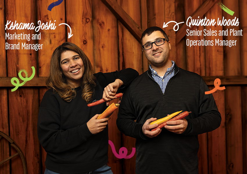
From an external overhaul to an internal vibrancy in vision, this statement refracts and reflects the journey Gwillimdale’s team and brand have undertaken over the past two years. Arcing from a refreshed identity to the recent launch of the company’s Arterra™ rainbow carrots, Kshama Joshi and Quinton Woods paint a multidimensional picture that splashes colour on every aspect of the business.
“Our rebrand really served as a catalyst for how we think about innovation. It gave us a stronger, clearer sense of who we are and what we want to bring to market. Since then, every new idea, from packaging design to product development, has been guided by that same brand purpose: delivering quality, freshness, and trust in ways that feel both modern and meaningful,” Kshama, Marketing and Brand Manager, outlines.
Quinton, Senior Sales and Plant Operations Manager, fills things in further by sharing how the rebrand also encouraged more collaboration across departments.
“Our teams are aligned on what the Gwillimdale brand stands for, which means innovation now feels more intentional and more consumer-driven. We’re not just launching products; we’re launching experiences that reflect our values and respond to what customers care about most—quality, transparency, and convenience,” he says.
Thus the canvas was set and the creatives poised for a launch that would perfectly reflect this deep change: Arterra rainbow carrots.
“Art,” the all-encompassing word for creative expression, combined with the Latin “terra” for “earth.” Art of the earth, as Kshama points out, ties beautifully back into Gwillimdale’s rebrand and what it stands for: creativity, authenticity, and a deep respect for nature.
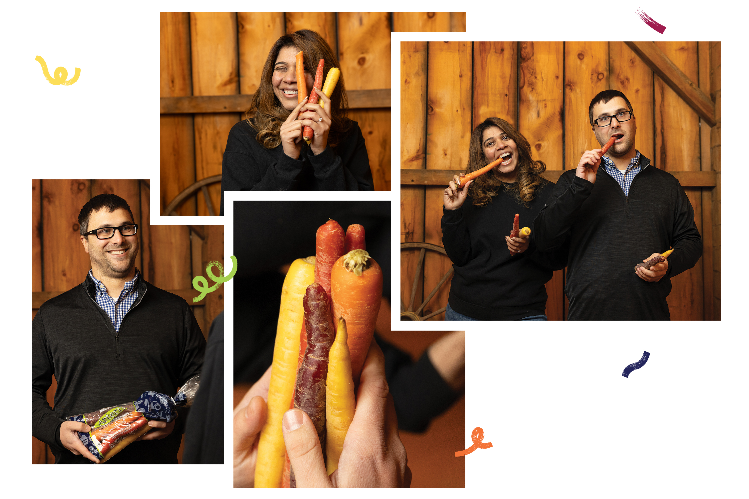
“Each carrot colour brings its own unique taste, nutritional profile, and visual personality, turning something simple into a living canvas of flavour and freshness,” she shares. “We partnered with growers and suppliers who share our high standards of quality to ensure consistency in every bag. The end result is something we’re incredibly proud of, a true expression of our brand brought to life through colour.”
The rainbow carrots make tangible the brightness Gwillimdale has woven throughout its culture and offerings, from its packaging and products to its story as a whole. Each hue, Kshama and Quinton point out, represents something unique: a distinct flavour, nutritional value, even a reflection of Gwillimdale’s brand diversity and depth.
And it drives home a broader truth: that fresh is so much more than the browns and greens that have been assigned to the “earthy” colour palette. Brilliant reds, wild yellows, shimmering purples, and so much more are yielded from the soil and sky around us.
After all, what is more natural than a rainbow?
“Last year, we redefined how people perceive staple vegetables like potatoes and carrots; this year, we’re elevating that idea by turning produce into a celebration of colour, taste, and meaning,” Kshama says. “It’s about showing that even the simplest vegetables can be extraordinary when you grow them with care, creativity, and purpose.”
Her statement brings into alignment the benefits of both a sales and marketing perspective, which prompts me to ask about how the project—and the reframe of Gwillimdale’s overall strategy as a whole—forged such a partnership.
"Last year, we redefined how people perceive staple vegetables like potatoes and carrots; this year, we’re elevating that idea by turning produce into a celebration of colour, taste, and meaning."
Kshama Joshi, Marketing and Brand Manager, Gwillimdale
“The synergy between sales and marketing has truly been the driving force behind our success. Quinton brings an incredible depth of knowledge about the retail landscape and a real understanding of what resonates with customers at the store level. He has this amazing ability to translate brand vision into commercial reality, bridging the gap between creativity and the customer experience,” Kshama shares. “Quinton’s perspective often pushes me to think about the why behind every creative choice—how a design, a word, or even a colour will connect with the person buying it. And, in turn, marketing brings that emotional storytelling layer that supports sales conversations and builds long-term loyalty.”
Quinton further elaborates on the dynamic partnership and how it wove into each point of the new product offering.
“When we developed Arterra, that collaboration became even more meaningful. From day one, Kshama and I worked hand in hand to ensure every detail—the name, the colour palette, the packaging design—told a cohesive story that would both stand out on shelves and stay true to our brand values. My insight into how shoppers engage with products met with her perspective of our story and brand, and it helped guide everything from display strategy to how we highlight product benefits on the pack,” he tells me. “It’s been a truly collaborative process between our sales, marketing, and production teams. The idea started from our shared belief that vegetables should be as fun and inspiring as they are nutritious. From there, we worked closely with our retail partners to ensure that everything from the pack design to the in-store presentation reflected our colourful, premium positioning.”
If there is anything I have learned of the art of nature, it is that its beauty often cannot be captured fully on the page, the canvas, or the photograph—some mediums save the moment, but all pale in comparison to the details and textures of witnessing it in person. A moment that will arrive for the first time at the Canadian Produce Marketing Association’s (CPMA) Convention and Trade Show.
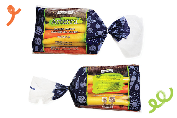
“CPMA is always an exciting time for us. It’s where we get to share our story directly with the industry and showcase how our innovations are shaping what’s next in fresh produce. This year feels particularly special because it’s the first time we’ll be bringing a lot of our new packaging designs and our Arterra rainbow carrots to the show floor. Our booth will be a true reflection of the Gwillimdale brand evolution—fresh and full of colour, mirroring the creativity and care that define everything we do,” Kshama shares.
Gwillimdale will be highlighting how its refreshed look and product line work hand in hand to communicate quality and authenticity, while also emphasizing convenience and consistency for both consumers and retail partners.
“Beyond Arterra, we’re continuing to invest in product diversification and new initiatives that enhance our offerings and strengthen our position in the market,” Quinton elaborates. “We’re also exploring new ways to deepen community engagement and food education, helping people, especially kids, understand where it comes from, how it’s grown, and why it matters to make healthy, informed choices. Ultimately, our vision remains the same: to keep growing better—for our consumers, our partners, and our brand. This year at CPMA, that vision will be brighter, bolder, and more colourful than ever before.”
I cannot think of a better produce exclamation point to this statement than a carrot of a different colour—one which has brought a multitude of facets into one bright execution, with Quinton and Kshama leading in orchestral succinctness.
“With Arterra, we both wanted to create something that wasn’t just a product, but an experience—vibrant, meaningful, and proudly Gwillimdale. It’s a great example of how collaboration between sales and marketing, rooted in trust and shared vision, can turn a creative concept into measurable success,” Kshama muses, leaving me with a final, integral thought. “It’s where our refreshed identity meets innovation in the most colourful way. Strategically, Arterra builds on our goal to showcase freshness, quality, and variety in everyday vegetables, while creatively, it allows us to express our brand’s vibrancy more boldly than ever.”
The point where quality and creativity meet—the story and the idea, inspired by the product—is the spark that catalyzes consumer intrigue. Likewise, Arterra, from vision to vegetable, has physically realized the intangible changes Gwillimdale began with its rebranding approach.
Modernization with meaning should not be sterile; it should reflect the human experience.
We came, we saw, we coloured everything.