A pivot in strategy does not always signal ineffectiveness of another. In some cases, it is a historic marker of the previous blueprint’s unlimited success.
This immediately struck me as the case when North Bay Produce pulled back the curtain on a calculated rebrand spanning its dynamic portfolio of berries, apples, asparagus, cherries, Brussels sprouts, and more.
Shortly after the announcement hit our desks here at The Snack, I connected with Brian Klumpp, Director of Marketing, to learn more about what sparked North Bay to roll out the first brand transformation in the company’s decades-long history.
 “Since 1984, our original logo has served us well, but as North Bay expanded beyond the Western Hemisphere and welcomed grower-owners from around the world, it became clear that our brand needed to evolve,” Brian notes, discussing North Bay’s fast-paced evolution. “The old map in our logo no longer reflected the global scale of our farms or the heart of our company: the farmers themselves. Recognizing this, we reimagined our identity to better represent who we are today and the people who make it possible.”
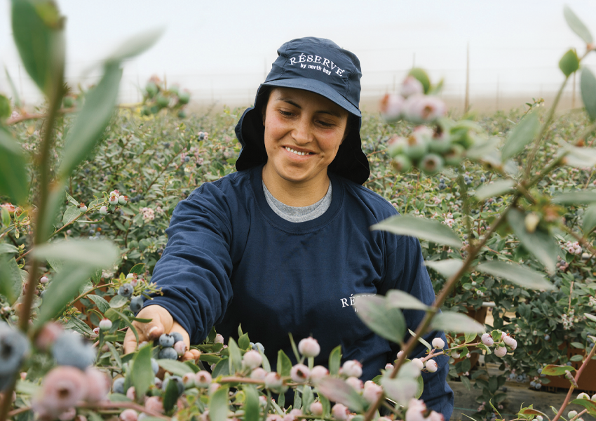
The brand’s reinvigorated identity sets out to clearly emphasize the integral roles of its people, who have remained at the center of the company’s success throughout its 42-year history. In addition to more clearly reflecting North Bay’s global scale and farmer network, this comprehensive refresh also aligns with a key point of interest for both retailers and consumers.
“North Bay’s global, grower-owned cooperative model is what sets us apart in the produce industry,” Brian continues. “Over the years, consistent feedback from retailers and consumers has affirmed the value they place on purchasing directly from the farmers behind their food. We listened and chose to put our farmers front and center when representing our company.”
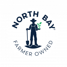
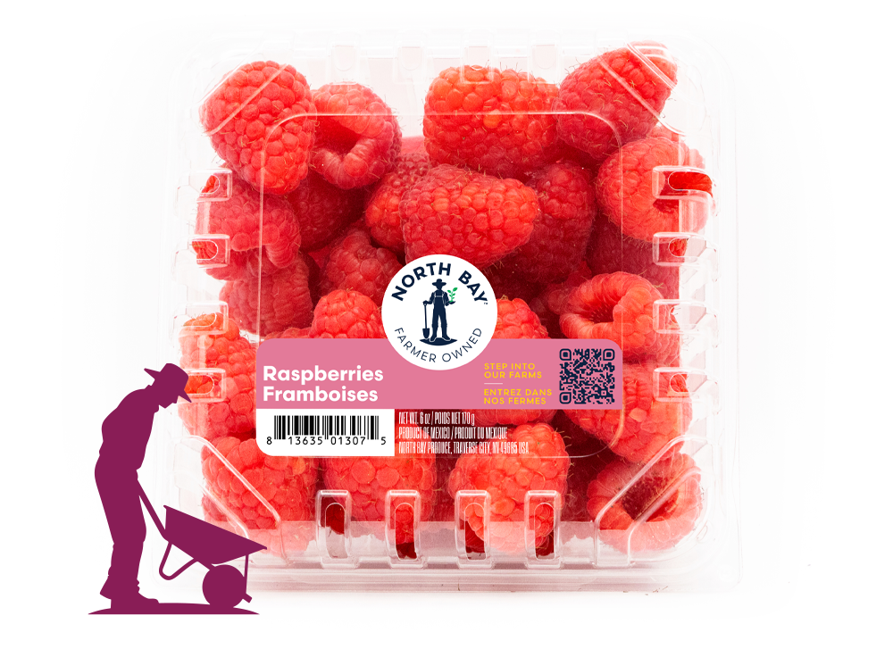
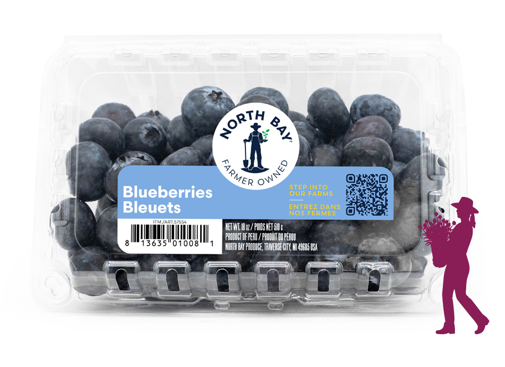
One of the first visual cues consumers will notice on-shelf is the brand’s new logo with a distinct icon centering the farmer. Celebrating growers as North Bay’s greatest asset, the new branding reflects the heart and soul of the company, underscoring a foundational commitment to connection, cooperation, and global reach.
Meticulously designed to be timeless, the symbol pays homage to the generations of farmers that have upheld North Bay’s success throughout its history. The farmer gracing North Bay’s new packaging serves as a universal figure, representing the diverse men and women that make up its impressive global network.
“The farmer is more than the icon of our new logo; it stands for the foundation of our business,” Brian explains. “Our farmers grow world-class produce, and we are committed to connecting consumers with the people behind it. When scanned, our labels transform into 3D-animated stories that bring our farms to life. These experiences, along with our broader marketing efforts, highlight the individuals who grow the produce North Bay proudly delivers to tables around the world.”
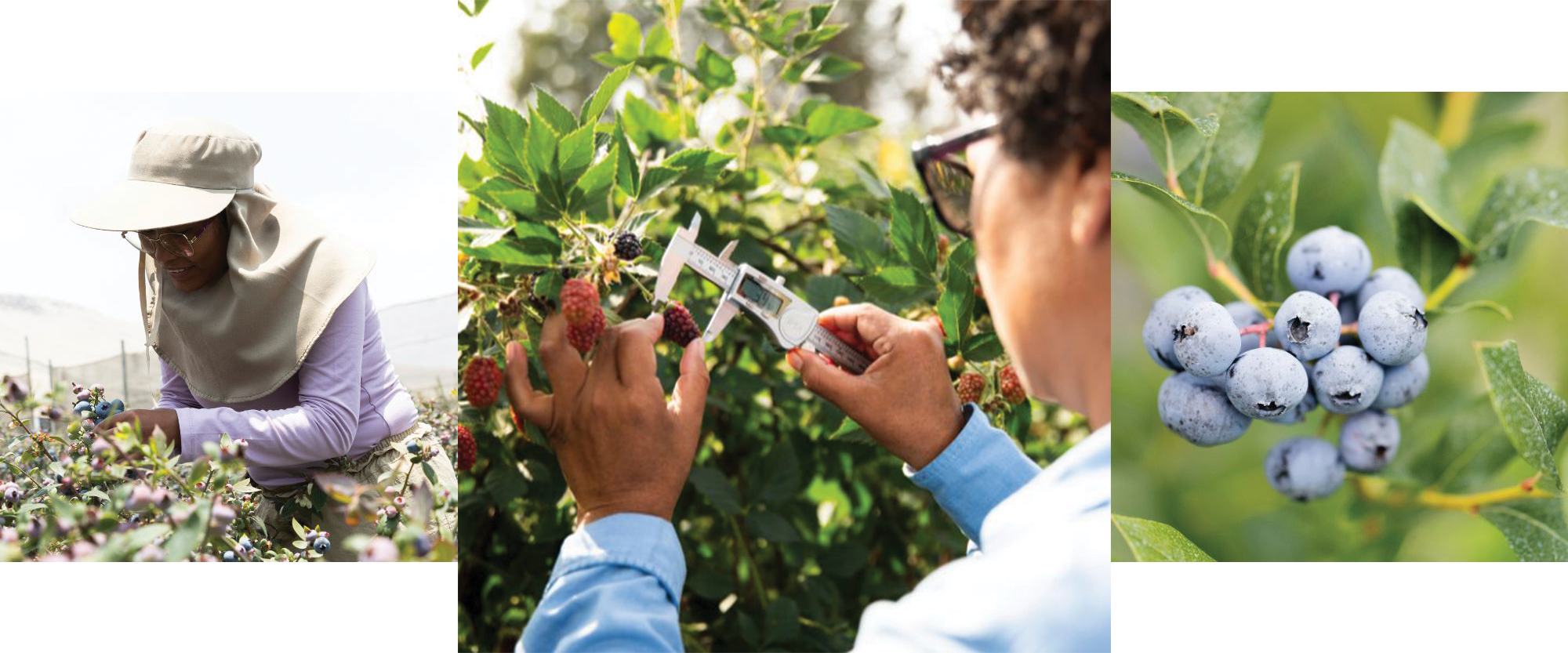
The dedication and work ethic of North Bay’s farmers have been the driving forces behind the company’s sustained growth since its roots were first planted in 1984.
Shining a light on the efforts of these integral players, North Bay’s strategic rebrand effectively merges grower-focused storytelling with increased on-shelf visibility.
The global cooperative has taken a unique approach to connecting consumers with the people who feed their families and the world, bringing farmers and their individual stories to life through an augmented reality (AR) experience integrated into its new packaging. With AR labels, shoppers are welcomed into an exploration of a 3D farm diorama that tells the stories of the people who bring their produce to market.
The innovative AR technology presents the supplier—and concurrently, North Bay’s retail partners—with an avenue for storytelling that directly connects consumers to the grower, their practices, and the exciting varieties being produced.
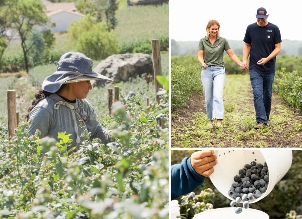
"Over the years, consistent feedback from retailers and consumers has affirmed the value they place on purchasing directly from the farmers behind their food. We listened and chose to put our farmers front and center when representing our company."
Brian Klumpp, Director of Marketing, North Bay Produce
“In our early years, the map symbolized our global footprint and year-round supply. Today, our industry partners already know North Bay as a worldwide operation,” adds Brian. “What consumers seek, however, is connection—an authentic link to the people who grow and stand behind their food. By combining elevated packaging with purposeful storytelling centered on our farmers, sustainability, and varietal innovation, we are uniting form and meaning. Our rebrand brings these winning themes together under one clear, compelling identity.”
By maintaining its focus on varietal development and expanding its global farmer-owner portfolio, North Bay Produce continues to elevate its performance, all while sharing the compelling stories of its farmer-owners with the consumers who enjoy its fruit and vegetables. These will continue to be key pillars of focus as the company maps out its long-term growth strategy fresh off the momentum of a legendary rebrand.
“We remain focused on three core priorities: varietal innovation, sustainable farming practices, and reinforcing our grower cooperative,” Brian shares when I ask him what’s next for North Bay Produce now that the company’s strategic rebrand is complete. “By further nurturing and expanding these pillars, we will continue to drive superior produce quality and long-term company performance.”
Guided by the same central focuses that have upheld the company since 1984, North Bay Produce is excitedly marking the start of a promising new era. Rest assured: The global fresh fruit operation’s reinvigorated branding is not a reflection of altered values, but a reaffirmation of its commitment to our industry’s most central player—the farmer.